Every drawing of a body carries an argument inside it — about proportion, about whose silhouette is the default, about which aesthetic tradition gets to define elegance. African fashion illustration, at its most rigorous, makes that argument visible. It does so not by simply adding melanin to a European template, but by constructing an entirely different visual grammar: one that draws simultaneously from West African graphic traditions, textile logic, and a deliberate rereading of modernist line-drawing. Understanding that grammar — technically and historically — is essential for any designer or illustrator working seriously with African dress.
The Discipline's European Origin and Its Structural Blind Spot
Fashion illustration as a professional discipline emerged in the early 20th century to accompany haute couture publications, with artists like Paul Iribe producing stylized plates for designers such as Paul Poiret from around 1908 onward. That origin point matters enormously. The conventions codified in those early decades — the elongated nine-to-ten-head figure, the lateral weight shift, the economy of line that privileges a narrow, high-waisted silhouette — were built to serve a specific body ideal and a specific couture context. They were not neutral conventions. They were aesthetic arguments that became invisible through repetition.
By mid-century, those conventions had calcified into industry pedagogy. Fashion illustration textbooks taught the same skeletal armature globally, and the figure that emerged from that armature was implicitly racialized: long-limbed, narrow-hipped, with facial features rendered in a shorthand that defaulted to Eurocentric structure. When illustrators working outside that tradition — particularly those drawing African dress for African contexts — adopted these conventions wholesale, the results were often technically accomplished but visually dissonant. The garments were right; the body carrying them was borrowed.
As an Amazon Associate, I earn from qualifying purchases.
What West African Graphic Traditions Actually Contribute
Pattern as Structural Logic, Not Decoration
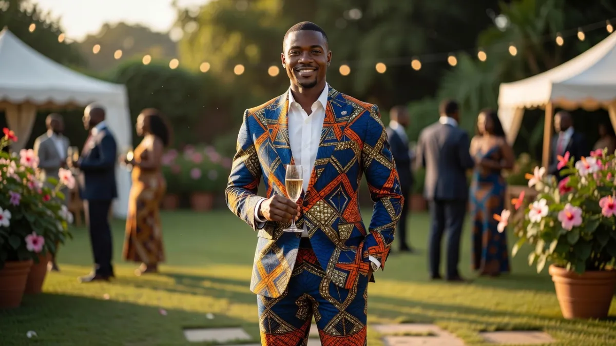
The most consequential difference between mainstream fashion illustration and illustration rooted in West African visual culture is the relationship between the figure and the surface it carries. In the European modernist tradition, pattern on a garment is typically subordinated to silhouette — it fills the form. In West African graphic traditions, pattern and structure are coequal. The adinkra symbols of the Akan people, the geometric logic of kente strip-weaving, the repeat structures in Ankara and wax-print textiles — all of these operate on a principle where the internal geometry of a design carries meaning independent of the outline containing it.
💼 Career Opportunities
When illustrators trained in this visual logic draw fashion, they do not subordinate print to silhouette. Instead, the illustration's compositional energy lives in the dialogue between the two. The figure becomes a field on which competing geometric forces play out — and that requires a fundamentally different approach to how the body itself is drawn. A figure rendered with the fluid, minimalist line of, say, René Gruau cannot carry the visual weight of a dense wax-print composition without collapsing. The body must be drawn with enough structural solidity to hold that dialogue without being overwhelmed by it.
Figural Proportion and the Politics of the Croquis
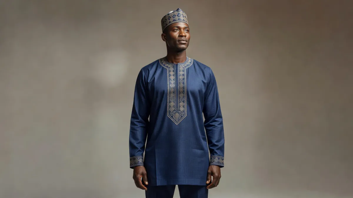
The standard fashion croquis is an idealization built on specific proportional assumptions. African fashion illustrators working consciously within their own tradition challenge several of these simultaneously. The hip-to-waist relationship is the most obvious: West and Central African dress — from the wrapped boubou to the tailored agbada — often constructs volume and grandeur through a generous lower body proportion that the standard croquis actively suppresses. Illustrators who draw from life and from a different aesthetic inheritance arrive at figures with lower centers of gravity, broader shoulder-to-hip relationships, and silhouettes that read as commanding rather than ethereal.
This is not simply a matter of body positivity as it is discussed in mainstream fashion media. It is a technical question about which body geometry a system of proportion is designed to flatter. Traditional wear from across the continent — the voluminous layers of Yoruba gele and iro-and-buba, the structural drape of Ethiopian habesha kemis, the geometric grandeur of Malian bogolanfini garments — demands a different croquis because it performs differently on a different body ideal.
As an Amazon Associate, we earn from qualifying purchases.
Diana Ejaita and the Construction of a Contemporary Visual Language
Diana Ejaita — the Nigerian-Italian illustrator whose work appears in the New Yorker, Frieze, and across editorial contexts — represents the most sophisticated current articulation of what this visual language can do at a professional level. Her work is worth examining technically because it makes legible principles that other practitioners apply more intuitively.
Line Quality and the Deliberate Use of Weight
Ejaita's line is not the nervous, gestural line of mainstream fashion sketching, nor the pure contour line of mid-century illustration. It has weight variation, but that weight is used architecturally rather than expressively — heavier lines define structural edges and garment masses; lighter lines describe surface and movement. This creates figures that feel planted, substantial, and present in a way that the conventional elongated fashion figure, with its suggestion of weightlessness, deliberately avoids. The body is drawn as a thing with gravity, and the clothes exist in relation to that gravity rather than floating over it.
The Face as a Carrier of Cultural Information
In mainstream fashion illustration, the face is often reduced to a graphic shorthand — the three-quarter turn, the half-closed eye, the suggestion of cheekbone. This shorthand works because it echoes a recognizable physiognomic norm. Ejaita's faces — and those of illustrators working in a similar tradition, including Laolu Senbanjo and Adeyemi Adegbesan — treat the face as a carrier of specific cultural information. Scarification patterns, the geometry of natural hair, the particular set of features that belong to specific ethnic physiognomies: these are rendered with the same graphic precision given to garment construction. The face is not a placeholder. It is part of the garment's cultural argument.
Negative Space and Textile Logic
One of the more technically sophisticated elements of illustration in this tradition is how negative space is handled around and within textile pattern. European modernist illustration tends to use negative space to emphasize silhouette — the white of the page isolates the figure and makes its outline the primary reading. In work that takes West African textile logic seriously, negative space functions differently: it is part of the pattern system. The unprinted ground of a wax-print fabric is as active as the printed motif, and illustration in this tradition often reflects that by treating the areas around and between pattern elements as positive compositional forces rather than empty ground.
The Question of Influence vs. Appropriation in Illustration Technique
It is worth being precise about something the broader conversation often blurs. The visual language described here is not simply African subject matter rendered in any available style — it is a set of technical decisions that emerge from specific graphic inheritances. When European or North American illustrators draw African dress using the standard elongated croquis and treat the print as surface decoration, they are not engaging with this visual language; they are doing something structurally different and often visually incoherent, because the body proportions and figure conventions they deploy are not designed for the garments they are depicting.
The illustrators who work most powerfully in this space — regardless of their own geographic origin — are those who have genuinely engaged with West and Central African graphic traditions as structural sources rather than decorative references. That engagement shows up in technical decisions: how line weight is distributed, how proportion is constructed, how the relationship between figure and textile pattern is managed compositionally. These are learnable, teachable skills. They are also skills that require unlearning certain default assumptions built into conventional fashion illustration training.
Practical Implications for Working Illustrators and Designers
Rethinking the Croquis from First Principles
The most useful starting point for illustrators working in this tradition is to build their croquis from observation of actual bodies in specific garments rather than from adapted versions of the standard armature. This means drawing the boubou's drape from how it actually falls on bodies built to wear it; drawing gele from how it interacts with the head's proportions and the neck's relationship to the shoulder. The figure that emerges from this process will not match the standard croquis, and that is precisely the point.
Studying Textile Structure Before Drawing It
Illustrators who draw African dress well tend to understand the construction logic of the textiles involved — not just their surface appearance. Kente's strip-woven geometry has a structural logic that changes how it drapes compared to a plain-woven cloth. Bogolanfini's fermented-mud-resist process creates surface texture with specific weight and hand. Wax-print's double-sided print quality means that gathered or folded areas show differently than they would in a screen-printed cloth. Illustration that captures this level of material specificity is not just more accurate — it is doing genuine design communication work.
Building a Reference Library Beyond Illustration
The most productive reference material for illustrators working in this tradition often comes from outside illustration itself: from the graphic design output of mid-century African independence movements, from the poster art of Afrocentric cinema, from the geometric systems underlying specific textile traditions, from contemporary painting in cities like Lagos, Accra, and Dakar. The visual language described in this article is alive and evolving in these contexts, and illustration that feeds from them will be richer and more grounded than illustration that draws only from existing illustration references.
Why This Matters Beyond Representation
The conversation about representation in fashion illustration often stops at visibility — at the question of whether Black figures appear in fashion imagery at all. That is an important question, but it is not the whole question. The deeper issue, for designers and illustrators with serious training, is whether the visual language being used to represent Black bodies and African dress is structurally adequate to the subject matter. A figure drawn in conventions designed for a different body ideal, wearing garments whose pattern logic is treated as decoration rather than structure, is not genuine representation — it is substitution.
What practitioners like Diana Ejaita demonstrate is that there is a fully developed alternative: a visual language with its own proportional logic, its own approach to line and surface, its own way of constructing presence and authority on the page. Learning to draw in that language — technically, rigorously, from its actual sources — is one of the more substantive things a fashion illustration practitioner can do, both for the quality of their own work and for the broader project of making illustration adequate to the full range of bodies and dress cultures it exists to serve.
Sources
Every factual claim in this article was independently verified against the following sources:
- Gazette du Bon Ton — en.wikipedia.org